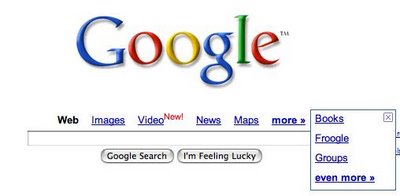
How could they pull Groups off of the front page and add an extra click to access it via the "more" button? Web, News, and Groups are the big three/holy trinity of useful information search. (I might call images a darkhorse #4.) Bumping books and Froogle makes sense, but Groups?

Example:
Imagine you're searching for Fantasy Football Draft Strategy. Where will the best info be? Web and News and Groups. Images aren't very helpful. Maps are useless. Books and Froogle are helpful, but more from a secondary standpoint if instant gratification fails. I'll concede that Video may be useful here one day, but only one relevant hit right now and still a secondary tier for quality info in my mind. Blogsearch doesn't even get an official front page nod and has better results.
I know they probably want to make room for Maps and Video as their "hot" products on the front page, but that seems really ill conceived and off brand. Couldn't they at least try to group things into related buckets? Or set a preference to choose what options each user wants displayed? Or would it kill them to add 3 more links, sort of how "Desktop" search magically appears if you have the application installed?
No comments:
Post a Comment